
Watermelon Symbol in Protest Art: Meaning and Origins
Symbols travel when words get blocked.
That’s basically the entire history of protest art: when language becomes risky, people switch to images.
One symbol that’s travelled widely in recent years is the watermelon, used in art and protest contexts as a sign of Palestinian solidarity—largely because its colours echo the Palestinian flag.
This isn’t “trend décor.” It’s visual shorthand.
Why a watermelon?
Multiple explainers trace its popularisation to restrictions around displaying the Palestinian flag after the 1967 war, with the watermelon used as an alternative visual cue because it contains the same key colours.
It’s also become a digital symbol (emoji, stickers, illustration) that can move across platforms where text might be moderated differently.
Why symbol-led posters work so well on walls
A symbol-led print does something typography can’t:
it communicates quietly,
it invites recognition,
it’s readable without being literal.
That makes it especially strong in shared spaces (hallways, living rooms, studios) where you want the wall to have meaning without shouting.
How to style symbol-led protest art thoughtfully
Give it breathing room. Don’t bury it in clutter; symbols lose power when they’re crowded.
Pair it with one typography piece. A symbol + a short statement is often the cleanest duo.
Don’t treat it as neutral. Symbols mean something—own the choice, or pick a different print.
If you want a CAPSIZE example of this approach, your Watermelon poster is explicitly positioned as subtle wall art while still carrying the message.
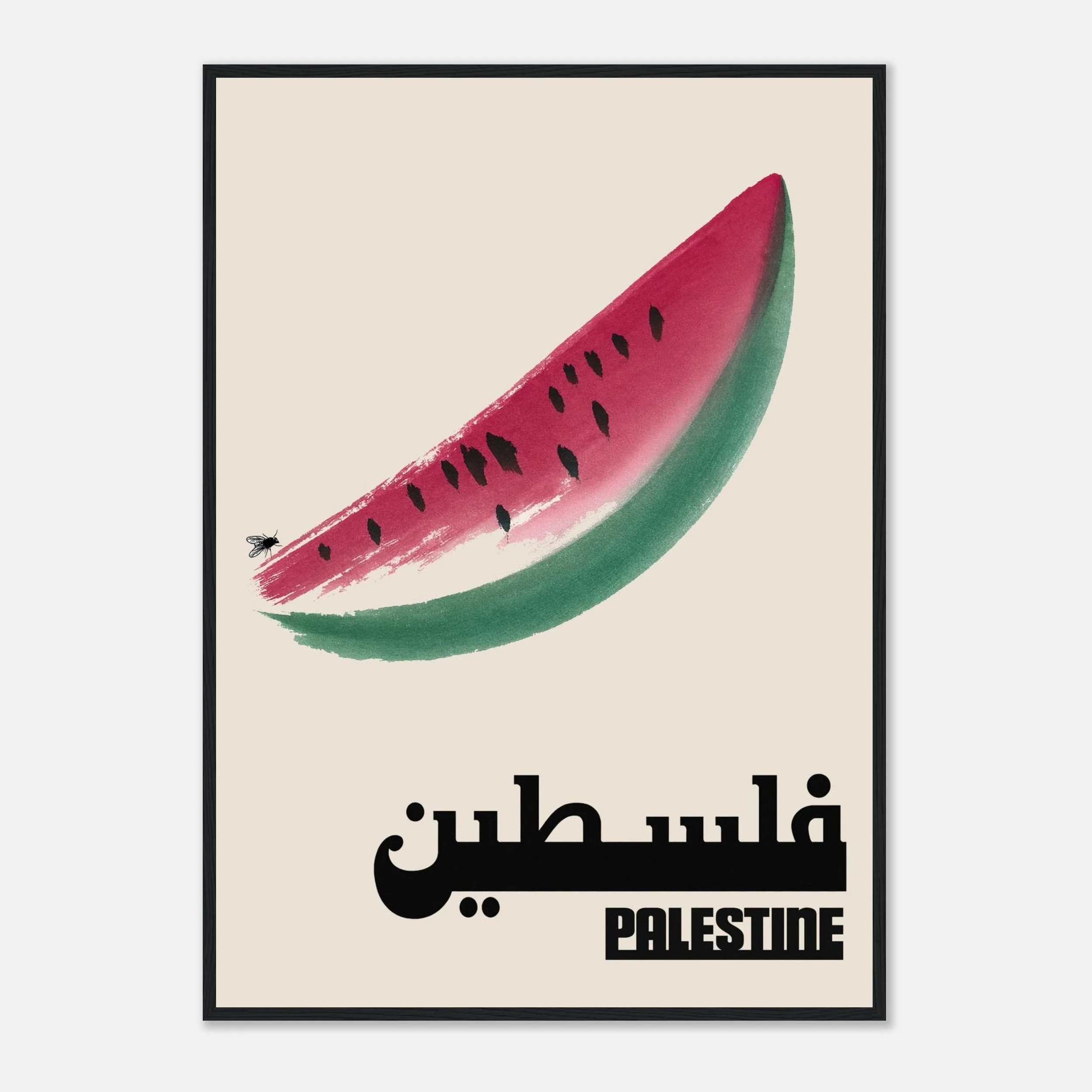
Palestinian solidarity through exotic fruit.
A simple image with layered meaning — the kind of symbol that carries politics without spelling everything out. This print is designed for collectors who understand coded visual language and want art that can be both beautiful and pointed. It hangs well in almost any room because it reads as graphic and modern first, and political second — until someone asks about it. Pair it with “Woman, Life, Freedom” or other resistance prints for a subtle-but-clear wall narrative