
Protest Poster Gallery Wall Ideas
A protest poster gallery wall should feel like it belongs on a street corner — not a dentist waiting room.
The trick isn’t buying more art. It’s choosing a layout that reads fast, feels intentional, and still has that “found in the city” energy CAPSIZE is built on.
This guide gives you a layout you can copy in one afternoon: sizes, spacing, and 3 easy templates that work in real homes (rented walls included).
Step 1: Choose your “anchor” print (the one that owns the wall)
Every strong wall starts with one piece that sets the tone.
Want bold + minimal? Start with a typography statement (think the kind of print that can be read from the doorway).
Want more bite? Start with satire.
Want movement energy? Start with a protest-led graphic.
Rule of thumb: if the wall is above furniture (sofa/sideboard/desk), aim for your main artwork grouping to span roughly two-thirds of the furniture width. It’s a classic proportion trick that makes everything look “designed” even when you’re winging it.
Step 2: Pick sizes that behave (A4–A1 cheat sheet)
CAPSIZE prints commonly run A4 to A1, which is perfect for gallery walls because you can mix small and large without weird ratios.
Here are the sizes people actually mean when they say “small/medium/large”:
A4 = 21 × 29.7 cm (8.3 × 11.7 in)
A3 = 29.7 × 42 cm (11.7 × 16.5 in)
A2 = 42 × 59.4 cm (16.5 × 23.4 in)
A1 = 59.4 × 84.1 cm (23.4 × 33.1 in)
Quick sizing picks
Small wall / hallway: 2–3 × A4/A3
Above a desk: 1 × A2 + 2 × A4
Living room feature: 1 × A1 (or A2) + supporting A4/A3s
Step 3: Use the spacing rule that saves every gallery wall
The easiest way to make a gallery wall look accidental is inconsistent gaps.
A reliable spacing target is 2–3 inches (5–7.5 cm) between frames/prints.
Pick a gap (2" looks tighter, 3" breathes more), and keep it consistent.
Three layouts that always work
Template A: “Statement + Echo”
Best for: minimalist rooms, home offices, small walls
1 × A2 in the centre
2 × A4 stacked on one side (or one A4 each side)
This is where your typography prints shine: one phrase sets the tone, the smaller pieces add rhythm.
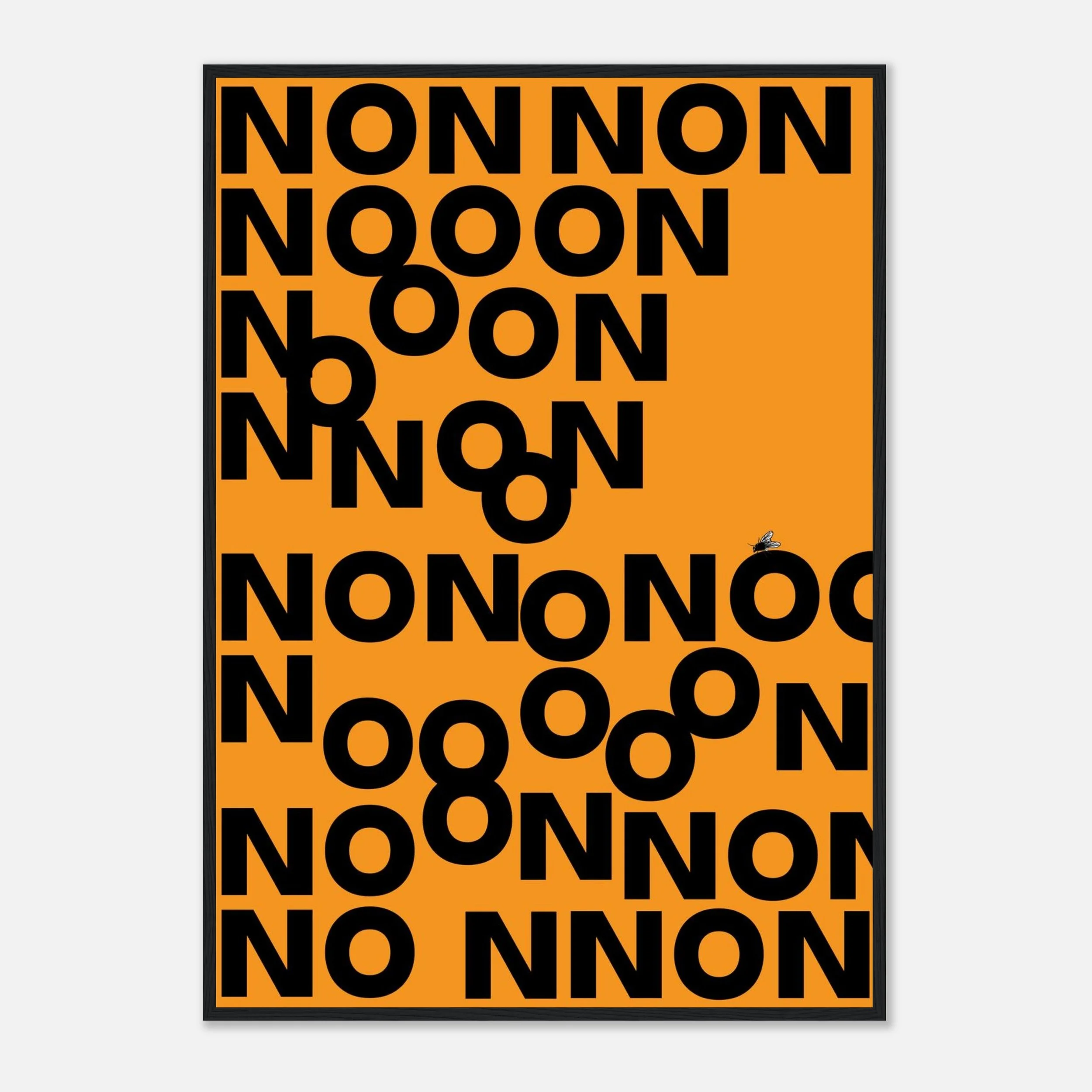
Non
Template B: “Street Cluster”
Best for: living rooms, big blank walls, maximalists
1 × A1 as anchor
1 × A3 + 2 × A4 around it
This mimics how posters actually live in cities: layered, varied, loud.
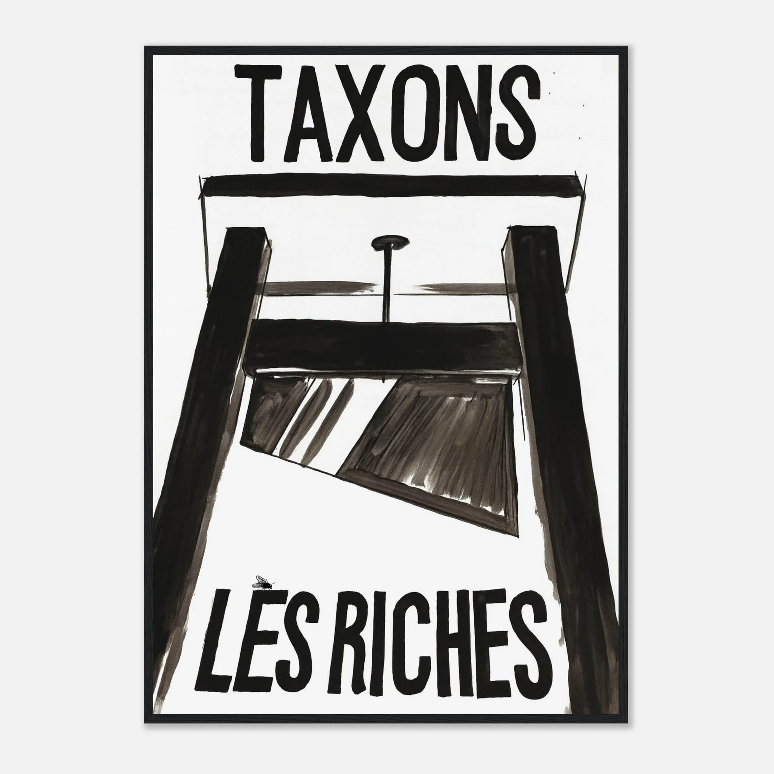
Taxons Les Riches
Template C: “The Triptych That Looks Expensive”
Best for: above sofas/sideboards
3 prints at the same size (A3 or A2) in a straight line
This is the fastest layout to install and the hardest to mess up.
Pairing idea: mix one protest-led print + one satire + one typography statement so the wall has range.
Framed vs unframed: what looks most “street”
CAPSIZE offers framed or unframed options (ready-to-hang if framed).
Framed: cleaner, sharper, “gallery finish”
Unframed: more raw, more temporary, closer to street poster culture
(If you go unframed, treat it like a poster: clean hands, tape/washi thoughtfully, keep it away from humidity.)
What you’re actually buying (and why it matters)
Your prints are described as premium matte giclée fine-art prints on heavyweight paper, which is exactly what you want for bold typography and strong contrast.
Mini FAQ
What’s the best spacing for a gallery wall?
2–3 inches between frames is a reliable guideline.
What size should I choose above a sofa?
Aim for the artwork grouping to span about two-thirds of the sofa width.
Do A-sizes match standard frames?
Yes—A4/A3/A2/A1 are standard frame sizes in many regions.